How to use a moody dark green paint as a neutral
I wasn’t sure it was possible either, but the first room I painted a moody dark green color, I realized it was more of a neutral than we give it credit for.
The first thing I did was head to Google and look up “What defines a neutral” and this is the exact definition that it Google gave me:
It is also a color which generally goes with every other color. Imagine colors like tans, beiges, ivories, creams, whites, blacks, and grays. These shades are very visually quiet in interior rooms.
December 28,2001
Ok, well that’s not helpful, but hear me out.
My first experience with the moody dark green paint color was the Woodgrain accent wall in the color Riverway by Sherwin Williams.
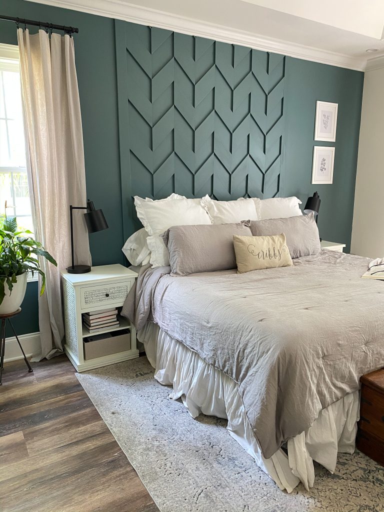
This moody dark green paint color was absolutely stunning in person and it complimented every single color I put next to it.
Putting my moody dark green paint as a neutral theory to the test.
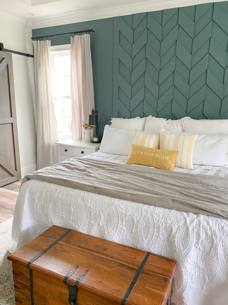
Pops of yellow for spring.
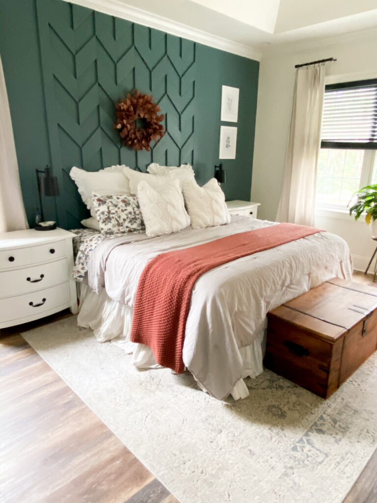
When I added rust in the fall, it looked absolutely stunning next to this moody dark green paint color on the walls.
Then I just started holding up all sorts of colors next to it: black, navy, red…and they all looked great.
It was at that moment I was convinced, moody dark green paint was the unsung neutral paint color we were all missing out on.
Sadly we had to move and I wanted to try my theory again.
When we moved into our new home, I wanted to test my moody dark green paint as a neutral theory again, but this time with a different color.
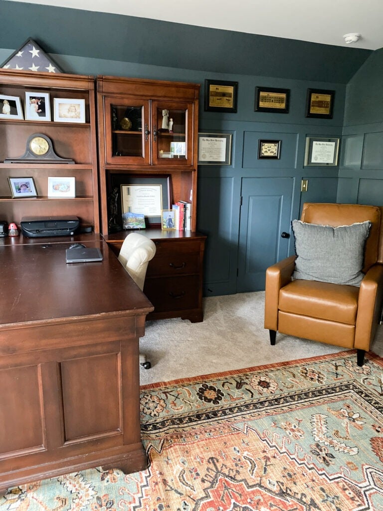
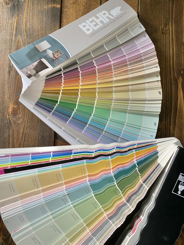
This time, I chose Brooklyn by BEHR Paint in my home office.
You can read all about how and why I chose this color for my office here.

For my home office I decided to do more of a color saturation and even since this last picture was taken, I’ve gone back and painted the window framing.
The only thing that I didn’t paint in this room is the ceiling and even now I’m thinking it should get some sort of treatment be it paint, wood, or even wallpaper.
Even though the color is darker doesn’t mean that you’re bound to stay on the darker side with decor.
Between the two room examples I used darker and lighter decor pieces to alter the look and feeling I wanted to achieve.
Speaking on what’s next, I found my inspiration for my next moody dark green paint color from a Stanley mug.

Don’t hate me, I’m not a Stanley girl, but when I saw this particular color at Target, it stopped me in my tracks. (Of course that mug is sold out, but this Stanley was still available if you want to see it in person.)
And there’s no wonder I was drawn to it, because when I color matched it, guess where I found it… on the same swatch as the color I painted my home office.

AND to top it all off, Watery is what we painted the eat in area of our last house so it was definitely destiny.
The bottom line lesson…
Don’t let rules and definitions literally paint you into a corner, instead I give you all the creative permission to think outside of the paint swatch and see color like you’ve never seen it before.

Let's connect!!
Stay connected for all your DIY and organizing needs!


Those are beautiful colors! My daughter’s nursery was painted a similar color 23 years ago, paired with light pink. I believe it was called Wooded Path by Behr (yes, I tend to remember paint colors, lol). I like to think of blues and greens as nature’s neutrals, because well…leaves, grass, sky, water!
Yesss that’s a perfect way to think about it!!