Avoid this mistake when choosing the best paint color
I’ve painted (and repainted) a lot of things, but I found something that takes the guess work out of choosing the best paint color.
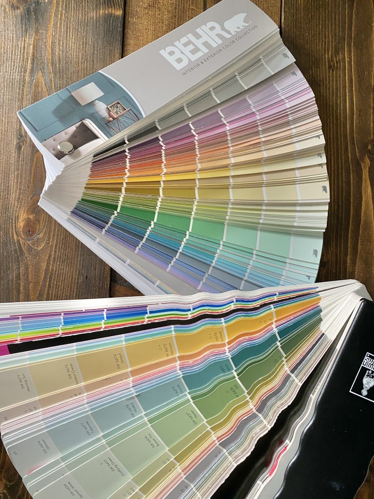
I don’t know about you, but choosing paint can be VERY overwhelming.
So many colors to choose from.
Let’s be honest, even thought paint is one of the least expensive ways to make a huge impact in a space, the cost starts to rack up if you choose wrong and have to paint again.
**This post contains affiliate links for various brands including Amazon, which does not cost you anything extra, but helps me earn a small commission that keeps my business grow. Click here for my complete disclosure.
And I don’t know about you, but looking at those paper paint samples make me go crosseyed.
Let me show you one of my most favorite tools in my paint arsenal:
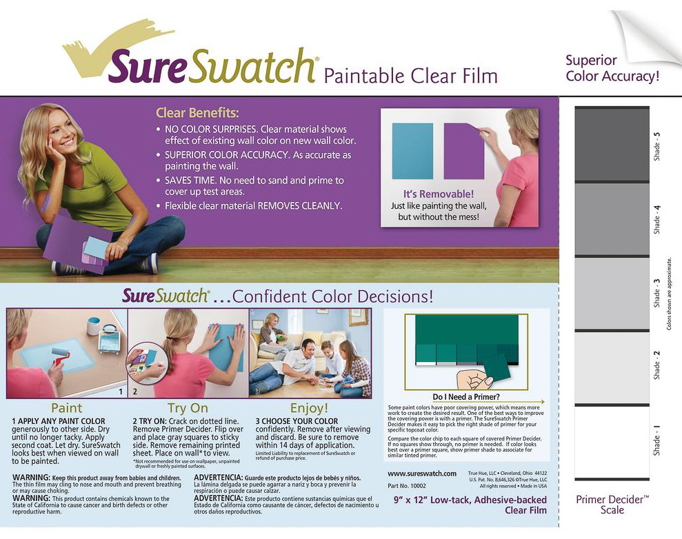
What’s so great about Sure Swatch?
Before I found Sure Swatch I would gather my little paint samples and end up painting these larger squares on our wall so I could visualize the actual color of the paint.
But then I would wonder what the paint would look like in a different spot or in different light and need to paint ANOTHER square.
Next thing I knew, I had all these squares painted all over the place.
The worst part would come when I needed to paint over the squares, I always felt I could see phantom squares on the walls.
All you do with this product is paint your paint sample onto the plastic film which is removable, meaning you can move it all around your space.
Painting Tip:
If you’re choosing between several colors that are similar, use a sharpie marker to write the name on the plastic film.
Where am I using this magical product now?
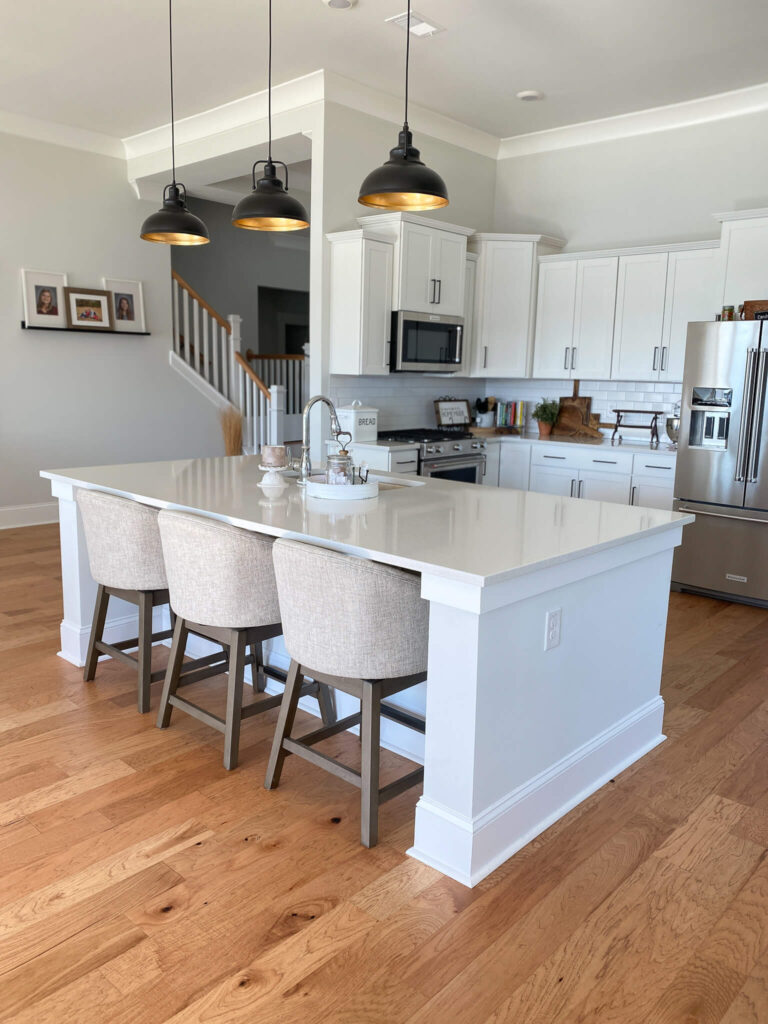
Remember how I said we are giving our kitchen island a new look?
I’m teaming up with Leen from Sanddollar Lane who’s showing us how she’s transforming a piece of furniture into an island with inexpensive shiplap.
Well I wanted black, but Courtney thought that dark gray, like what I painted our thrifted cabinet, would be better.

Knowing that I’m full blown in the laundry room makeover, I wanted to prove my point without destroying the kitchen island, so this is the most logical way to show him. (That I’m right of course)

Thankfully I had plenty of Iron Ore left from the cabinet and laundry room projects, that’s the bottom color.
The only paint I bought was a sample from Home Depot of Sherwin Williams Tricorn Black for $5.00
Painting tip:
You can have any color you like from any company mixed in the paint brand that you prefer.
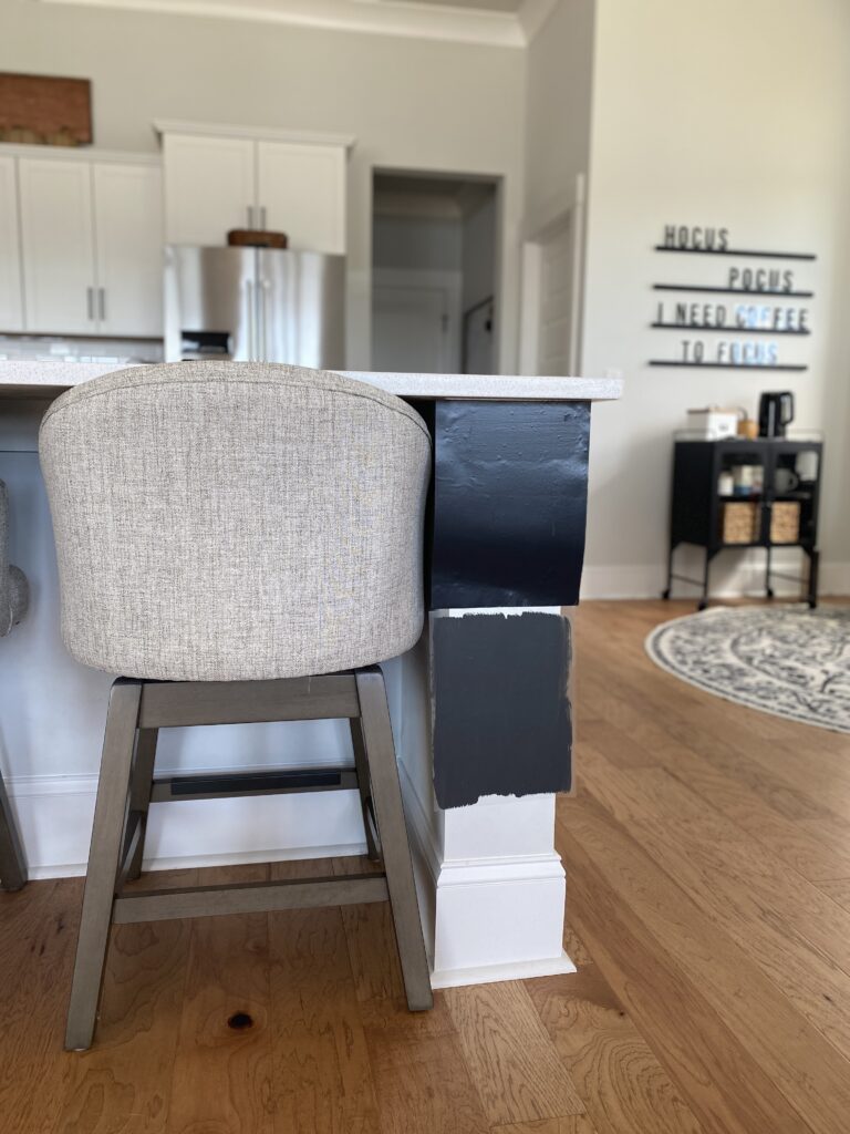
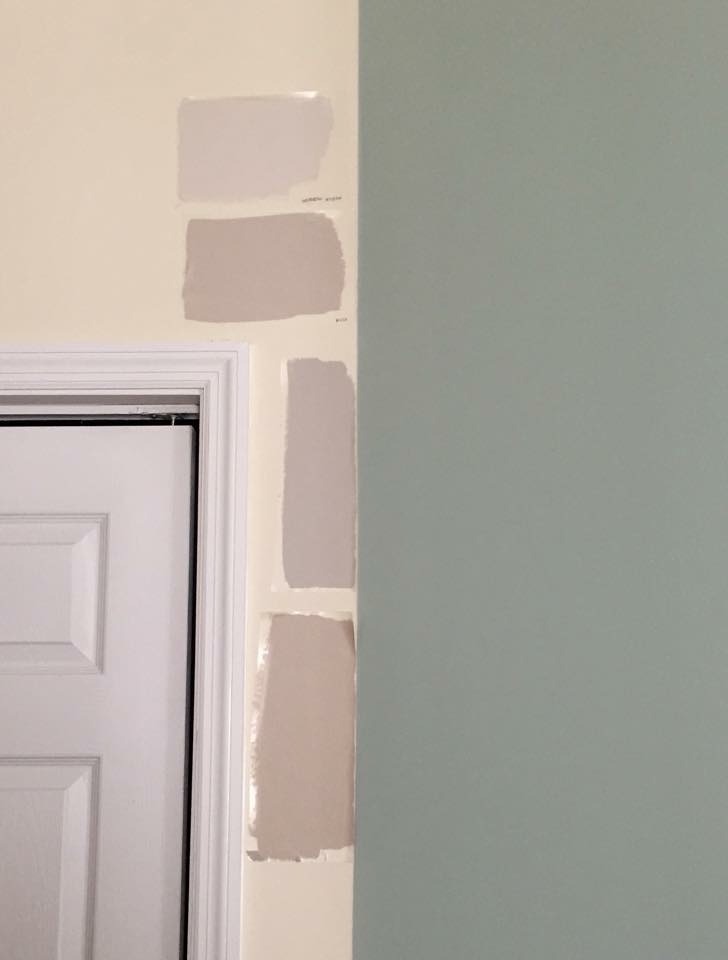
This was one of the angles that pretty much made the decision for me because I am real funny when it comes to gray.
To me they have to be in the same family and this chair has more brown or taupe undertones to the gray and the bottom sample of Iron Ore has more blue.
That doesn’t work for me.

This was the view that pretty much closed the deal and we are for sure picking Tricorn Black.
Most of our house has black accents and while I want the kitchen island to be a bold statement, I think it still needs to coordinate with the rest of the house.
Especially the pendant lights.
There you have it, we made a paint choice without making a huge mess and a big mistake.
My husband Courtney was convinced he wanted Iron Ore even though I was set on black.
It just took a few samples and moveable Sure Swatch film to show him what I already knew.
Now we’re on to other debates, like what we should do with the ends of the kitchen island.


Let's connect!!
Stay connected for all your DIY and organizing needs!